CITYSCAPES - Curator Steve Grody > FIRST PLACE (click)
FIRST PLACE (click)
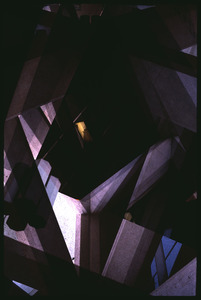
MAXWELL by Stephen Quinlan
(Click on image for reviews)
(Click on image for reviews)
CURATOR STEVE GRODY:“This was the most compelling image to me. The formal balance and range of tones are very strong, and the vagueness of just what we are looking at is an enjoyable tease. Jerry Okun would be a fellow spirit aesthetically. I am assuming that this is a composite image, and if so, what that means is that Stephen took artistic responsibility for the specific arrangement, an interesting and involved approach."
Steve asks what is Quinlan's process.
STEPHEN QUINLAN: "My process has many aspects to it, and it begins with collecting. When I moved back to New York with my wife last August, we started going to a lot of "junk shops" and secondhand furniture stores to fill our new apartment on the cheap. I noticed a lot of these stores would have bowls and binders filled with old Kodachrome slides. They feel very precious, and I couldn't help but collect as many as possible. Eventually I started ripping the slides from their holders and layering them into new holders. John Baldessari's axiom that "1 image + 1 image = 3 images was an idea that fascinated me in graduate school, and now it seems I had found a process of image-making that got straight to the core of that axiom. From collecting to finished image, my process involves these steps, specifically:
1. I spend (too much) time with my ever-growing pool of positives, organizing and experimenting with image pairs or triplets.
2. When I have 24 groupings, I rip the individual slides from their carriers and combine them into single frames.
3. Then I scan the entire batch with a consumer flatbed scanner. (With the diversity of image density I'm working with, a lot of my combinations just don't scan. This step saves me time and money scanning unusable images professionally.)
4. Then I scan the best images with a high-res Imacon neg-scanner at a professional lab.
5. And finally I can use the magic of photoshop to bring the scans back to relative saturation and brightness.
I hope I'm not disqualified for using found images! I'm still utilizing composition, focus, and light, just like a traditional photographer. And, especially when it comes to an image like "Maxwell", the label of "cityscape" becomes that much more interesting. Not only is my image made from two photographs of what is presumably urban landscape, but my process of collecting the slides from every corner of my own city, is highlighted. In a sense, ALL my images are "cityscape", as they are from tiny pieces of a city that will try to sell you anything, even tiny, beautiful, lost memories."
CURATOR STEVE GRODY: "I very much enjoyed reading about your process, thank you for the detail. Rather than "disqualify" you (ha-ha), it makes me appreciate the final images that much more. Keep up the great (labor-intensive) work!"
CURATOR JANE SZABO: "The winning selection for the competition Cityscapes is a refreshing interpretation of urban landscape. Part Cubism and part Rothko, the image celebrates abstraction with hints of a painterly palette. Reading about the artist's process of layering found images made me appreciate thee final product even more"
CURATOR STEVE ZMAK: "Stephen Quinlan's photomontage somewhat reminds me of the three-dimensional wood puzzles I would agonize over as a kid. They were so perfectly crafted, intricate and complex, and forming a perfect geometric form when assembled: a sphere, cube, cone or pyramid. I would slide out a single piece and it would crumble into a mess of random shapes, a collision of chaotic angles that I would never be able to assemble into it's original perfect form again. Now mix that with the vision of illusionary illustrator M.C. Escher, and you come up with this winning image. Reading the artist's statement brought a deeper level of appreciation in that the materials used and how they were combined are so symbolically urban-recycling found objects, piecing together fragments into something new, and building over what came before. What better medium to convey the diversity, chaos, and order of a city."
----------------------------------------------
Stephen Quinlan is a surrealist photographer and filmmaker who mixes analog and digital processes to better understand his own position in the history of image-makers. Being caught between the warm memory of analog fuzz and the cold reality of surfaceless digitalia, his art attempts to bridge modes of understanding between disparate cultures and generations.
To learn more about Stephen go to:


